Logos
This is the visual appearance of the brand that will be used across primary applications. To maintain brand consistency the visual mark always has to be applied with care and respect in every application according to the ForceManager guidelines.
Download the logos from our marketing resources.
The horizontal version is our primary logo. It will be always used, except in formats where legibility would be affected.
The vertical version will be used only in special cases, where legibility would be also affected.
The isotype will be used when the FM brand must be displayed in a reduced size.
The ForceManager Logo
The best logo use is in primary Orange (Orange-500) on a white background. The neutral (Grey-600) can also be used on light colored backgrounds. For orange and other similar colored backgrounds the logo always be white. Finally for dark backgrounds, the logo should always be white with the tritium shape in orange.
Logo Positive
Logo Neutral
Logo Negative
Logo Negative 2
Logo Vertical
Logo Text
Add-ons
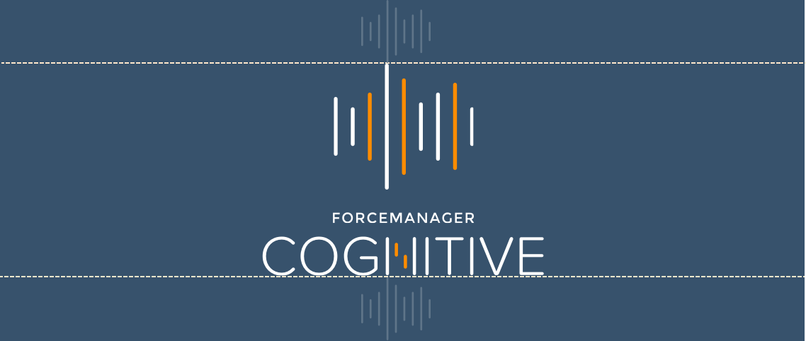
Cognitive

Delimited Area
The delimited area refers to a set of margins around a logo that must always be respected, and remain free of intrusion from other graphic elements to ensure their legibility. This delimited area is increased or reduced proportionately to the logo’s size.
Safe Zone
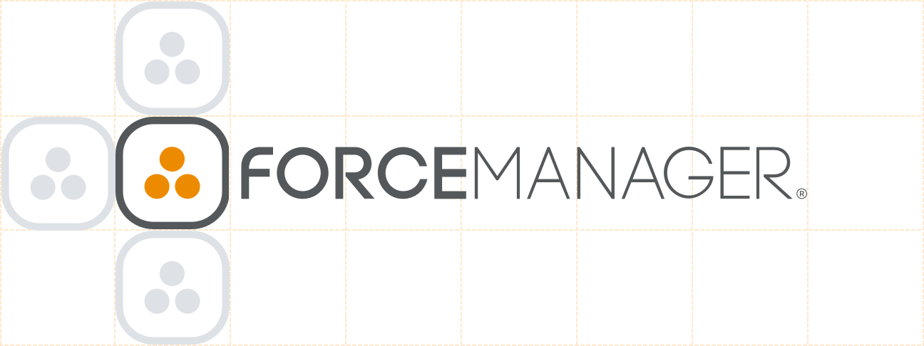
Minimum Safe Zone


Minimum Sizes
ForceManager Logo
Cognitive Logo


Misuse of brand logo
To maintain brand integrity, the logotype must always be presented clearly and accurately in all applications. The logo should never be distorted, manipulated or altered in any way.
Make sure the logo is readable over background images.
The logo should not be placed over images, artwork or backgrounds that negatively affect legibility
Don’t place elements in the logo clear space

Don’t place elements in the logo clear space

Don’t place elements in the logo clear space

Don’t place elements in the logo clear space

Don’t place elements in the logo clear space

Don’t place elements in the logo clear space

